

Using Stats for Group Comparison In Only 3- Steps
↓
Hi All,
Konstantin here! Today, we have a takeover of the newsletter by no other than Frank Mu, an organizational scientist who will teach us about a simple 3-step process to reliably identify and understand group differences!
Check it out here! I am super excited!
Hi everyone!
My name is Frank, and I'm an organizational scientist with a deep passion for people analytics.
Today, I will discuss how to statistically identify differences between groups. Why do you need this? Here are a few examples:
Which departments have higher engagement?
Which sales team brings the most revenue?
Which sourcing channels give us better hires?
But finding the difference is only one part of the problem. You need to understand just how large the difference is. After all, you probably would not care about differences that don't matter.
Today, I will share how I think about comparing groups using stats.
Here is the 3-step process at the high level, and I break it down below:
Look at descriptive statistics by group
Deep dive into statistical analysis
Use effect sizes to judge the magnitude of the difference quickly
And let's explore this 3-step process with an example:
Imagine we collected engagement scores using a traditional engagement survey with 1-5 point scales. The data are survey responses from 30 IT and 76 customer service employees.
Which department has higher engagement?

1. Start with Descriptive Statistics by Department
First, start with understanding each group by looking at what an average employee in the group scores (typically using the mean) and understanding variability between groups or how spread out the responses are (typically using standard deviation; SD).
In our example, the average engagement score for IT is 2.5 (SD = 0.6), whereas the average score for Customer Service is 3.2 (SD = 1.0). On average, engagement is 0.6 points higher among Customer Service employees than IT employees.
Next, we visualize the differences using boxplots:
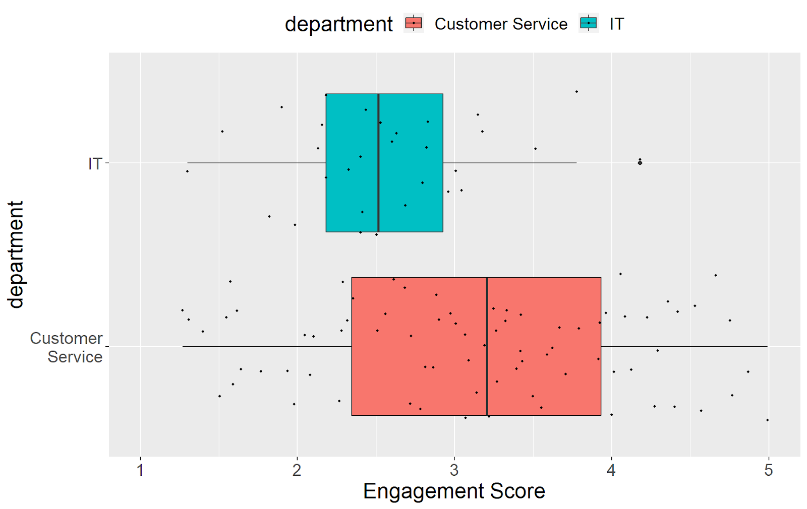
Here, each dot represents an employee in their group. The box represents the middle 50% of scores, and the whiskers represent the range where most (~99%) of the scores fall.
We can easily see that Customer Success employees have a higher average and variability in their engagement scores than IT employees.
But what exactly does this difference of 0.6 even mean? Is it large or small? Should we worry about the IT department?
I know… You might be tempted to divide the difference of 0.6 points by the lower group's average and say that Customer Service Scores are 24% higher than IT ones. Still, this approach only considers the average and ignores the variability in scores. Just look at the graph and see how spread out the scores in CS are!
To better answer this question:
2. Deep Dive into Statistical Analysis
We use statistical tests to confidently say that the differences between groups are statistically significant and real.
You'll learn various statistical analyses to examine group differences in your people analytics journey. For example, you might use hypothesis (A/B) testing techniques, such as a t-test, to determine whether the departments have a statistically significant difference in average engagement scores.
Nowadays, doing these kinds of deep dives is easier than ever because statistical software can easily let you perform hypothesis tests!
For example, when using R, the t.test() function performs a hypothesis test comparing the difference in the average of two groups (See here for technical details).
But, even if you don't have an R programming background, you can still run a t-test in Excel or an online calculator.
In this case, conducting a t-test does show statistically significant results, suggesting that the difference in average scores is meaningful. Considering each group's average and spread of scores, we can be confident that the 0.6-point difference is unlikely to have occurred by chance alone.
3. We then use effect sizes to explain the difference
Armed with the results of our statistical analysis, many analysts might be tempted to start reporting the findings and working on the recommendations.
But what happens when your stakeholders ask follow-up questions like "Umm... What's a t-test?"

You can use a probability of superiority (PS) effect size to explain the difference in plain English.
PS is the probability that a randomly selected value from one group is larger than a randomly selected value from another group. To compute it, we run an analysis that randomly chooses an observation from the first group and compares it to a random observation from the second group. And we do this over and over and over again, counting how many times the first group scored higher than the second.
Tedious?
Well, we have computers to run the analysis in just a few seconds!
In our example, we use R (specifically, this package) to compare all possible matchups between IT and Customer Service engagement scores and compute the fraction of these matchups where the CS scored higher than IT.
We get 32%.
What does it mean?
Simple:
Customer service employees have, on average, 32% higher engagement scores than IT employees.
This conclusion is much easier to communicate to your stakeholders than:
CS is 0.6 points higher than IT
There is a statistically significant difference with a t-value of 3.58
The groups are different at p < .01
What?
You cannot argue that saying 32% difference is much easier to interpret!
What is also important is that it gives you an unbiased estimate of the difference, considering the variability in your scores, unlike a simple percentage.
So, yeah, you probably should dig into what's up with IT!
What do you think? Curious to learn more? What other use cases can this apply to? Connect with me on LinkedIn to chat more about this!
Frank
Whenever you're ready, there are 2 ways I can help you:
#1
If you're still looking to get started in People Analytics, I recommend starting with my affordable course:
Practical People Analytics: Build data-driven HR programs to 10x your professional effectiveness, business impact, and career. This comprehensive course will teach you everything from building an HR dashboard for business results to driving growth through more advanced analytics (i.e., regression). Join your peers today!

#2
If you are looking for support in your human capital programs, such as engagement, retention, and compensation & benefits, and want to take a more data-driven approach, contact me at Tskhay & Associates for consulting services. Or simply reply to this email!